DDoS Predictive Risk – Project Documentation
Automatic Risk Calculation & Loss Forecasting (Component 4)
1. Project overview
This project implements Component 4: automatic risk calculation, predictive loss forecasting, and dynamic USD-to-local-currency conversion for DDoS risk. The backend aggregates attack data, runs an ARIMA forecast, fetches exchange rates, and computes risk and loss. The frontend dashboard shows key metrics, risk forecast charts, financial impact, reporting, what-if simulation, and alerts.
Risk formula: Risk (Loss) = Probability × Cost_per_Attack_USD × Exchange_Rate
2. Project structure & files
| Path | Role |
|---|---|
backend/app/main.py | FastAPI app: risk overview, report, alerts, export CSV, what-if, manual attack, demo load |
backend/app/config.py | Settings: dataset dir, currencies, cost per attack, history/forecast days, min training points |
backend/app/data_loader.py | Load CICDDoS CSVs, hourly counts, aggregate daily/hourly, demo series generator, merge manual attacks |
backend/app/forecast.py | ARIMA training and forecast; probability of high-attack day |
backend/app/risk_engine.py | Exchange-rate fetch, forecast timestamp builder |
backend/app/schemas.py | Pydantic models for API request/response |
notebooks/01_clean_cic_ddos_dataset.ipynb | Clean CIC-DDoS2019 CSVs → cleaned_events.csv, hourly_attack_counts.csv |
notebooks/02_train_and_evaluate_models.ipynb | Classification (RF, XGBoost) and forecasting (ARIMA, XGBoost); metrics and plots |
scripts/run_train_and_evaluate.py | CLI script: same classification + ARIMA forecasting pipeline, writes results to results/ |
frontend/src/ | React (Vite): Dashboard, Risk Forecast, Financial Impact, Reporting, What-if, Alerts, Data & Model |
data/CICDDoS2019/ | Raw CIC-DDoS2019 CSV files (LDAP, MSSQL, NetBIOS, Portmap, Syn, UDP, UDPLag, etc.) |
data/cleaned/ | Output of notebook 01: cleaned_events.csv, hourly_attack_counts.csv |
results/ | Charts: metrics bar, confusion matrix, forecast actual vs predicted, recall per class |
models/ | Saved models and model_metadata.json |
3. Dataset used
CIC-DDoS2019 is used for both classification and time-series forecasting.
- Source: CSVs in
data/CICDDoS2019/(e.g. LDAP.csv, MSSQL.csv, NetBIOS.csv, Portmap.csv, Syn.csv, UDP.csv, UDPLag.csv). - Columns used:
Timestamp,Label, and all numeric columns (excluding Flow ID, IPs, Timestamp, Label) for classification. - Labels (classes): BENIGN, LDAP, MSSQL, NetBIOS, Portmap, Syn, UDP (and possibly UDPLag in raw data).
- Cleaning (notebook 01): Normalize column names, parse timestamps, drop duplicates, optionally limit rows per file (
MAX_ROWS_PER_FILE). Outputscleaned_events.csvandhourly_attack_counts.csvfor forecasting.
4. Notebooks
01_clean_cic_ddos_dataset.ipynb
Loads all CSVs from data/CICDDoS2019/, normalizes columns, parses Timestamp and Label, drops duplicates (by Timestamp + Label), sorts by time. Writes:
data/cleaned/cleaned_events.csv(Timestamp, Label, source_file)data/cleaned/hourly_attack_counts.csv(bucket, attack_count) for time-series
Configurable MAX_ROWS_PER_FILE limits rows per CSV or uses full files.
02_train_and_evaluate_models.ipynb
Two main parts:
- Classification: Loads cleaned/raw data, keeps numeric features, encodes labels, splits train/test (e.g. 75/25, stratified). Trains Random Forest and XGBoost classifiers. Computes accuracy, precision, recall, F1 (weighted) and per-class recall. Produces bar chart of metrics, confusion matrix (XGBoost), and recall-per-class bar chart. Saves models and artifacts to
models/. - Forecasting: Builds time-series from
hourly_attack_counts.csv(or minute-level from cleaned/raw events). Trains ARIMA(1,1,1) and optionally XGBoost regressor for comparison. Plots actual vs predicted (ARIMA and XGBoost if present). Saves forecasting artifacts.
5. How the models were created
- Classification: Data is loaded from CICDDoS2019 (or cleaned) → numeric columns only, inf/nan handled (median fill) →
LabelEncoderon labels →StandardScaleron features →train_test_split(stratified, 0.25 test,random_state=42) →RandomForestClassifierandXGBClassifierfit on training set → evaluated on test set. - Forecasting (production backend): Backend uses ARIMA only. Time-series is built from
data/cleaned/hourly_attack_counts.csvor by aggregating raw event CSVs to daily/hourly counts. Last 90 days (configurable) are kept. If series has < 30 points, a median baseline is used; otherwise ARIMA(1,1,1) is fitted and forecast for the next 10 days (configurable). Forecast timestamps start the day after the last history date so the chart is contiguous. - Forecasting (notebook/script): Same ARIMA(1,1,1) plus optional XGBoost regressor on lagged features for comparison; produces the “Actual vs Predicted (ARIMA & XGBoost)” plot.
6. Models used, hyperparameters & why
| Model | Use | Hyperparameters | Why |
|---|---|---|---|
| Random Forest | Classification (attack type) | n_estimators=100, max_depth=15, random_state=42, n_jobs=-1 |
Robust, less overfitting with depth limit; baseline for comparison with XGBoost. |
| XGBoost (XGBClassifier) | Classification (attack type) | n_estimators=100, max_depth=8, random_state=42, eval_metric="mlogloss" |
Typically better accuracy/precision/recall on tabular data; handles mixed features and class imbalance well. |
| ARIMA | Time-series forecast (attack count) | order=(1,1,1) |
Simple, interpretable; one lag and one MA term with differencing (I=1) for non-stationary counts. |
| XGBoost (XGBRegressor) | Forecasting (notebook/script only) | n_estimators=100, max_depth=6, random_state=42 |
Compare to ARIMA; better at capturing spikes/non-linear patterns in the evaluation plot. |
Other settings: train_test_split test_size=0.25, stratify=y; StandardScaler fit on train only; RANDOM_STATE=42 / random_state=42 for reproducibility. Backend config (env): HISTORY_DAYS=90, FORECAST_DAYS=10, MIN_TRAINING_POINTS=5, AVG_COST_PER_ATTACK_USD=500, BASE_CURRENCY, TARGET_CURRENCY (e.g. LKR).
7. How components are connected
- Data flow: CICDDoS2019 CSVs → notebook 01 →
data/cleaned/. Notebook 02 / script reads cleaned or raw data → trains classification and forecasting models → writesresults/*.pngandmodels/. - Backend: Reads
data/cleaned/hourly_attack_counts.csvor aggregatesdata/CICDDoS2019/*.csv; merges in-memory manual attacks fromPOST /api/risk/attack; optionally uses demo series when?demo=1. Callstrain_arima_and_forecast()andprobability_of_high_attack_day(), fetches exchange rate, builds history and forecast points, computes risk score and levels, and returns overview/report/alerts/CSV/what-if. - Frontend: Calls
GET /api/risk/overview(and report, alerts, export, what-if) with optional?demo=1. Displays key metrics, Risk Forecast and Financial Impact charts, Reporting, What-if Simulator, Alerts, and Data & Model. “Load demo” toggles demo mode; “Refresh” refetches.
8. How the model works in the app
The live dashboard uses only the ARIMA-based forecasting path (no classification in the API).
- Backend loads last 90 days of attack counts (daily or hourly aggregated to daily for display).
- If < 30 points: forecast = constant (median of last 8). If ≥ 30: ARIMA(1,1,1) is fitted and forecasts the next 10 days.
- Forecast timestamps are the 10 days starting the day after the last history date.
- Probability of “high attack day” = fraction of forecast days above the 75th percentile of history.
- Risk score = 0.55 × (probability of high attack) + 0.45 × (expected probability); scaled 0–100. Level: Low / Medium / High / Critical.
- Loss per day = attack_probability ×
AVG_COST_PER_ATTACK_USD× exchange rate (USD → LKR or other).
What-if uses the same baseline (expected daily loss from overview); user inputs cost per attack, mitigation %, and budget; backend returns projected loss and savings.
9. Model performance
Classification and forecasting performance are evaluated in the notebooks and script and reflected in the results/ images.
Classification metrics (Accuracy, Precision, Recall, F1)
Both Random Forest and XGBoost achieve high scores; XGBoost is typically slightly better across all four metrics (e.g. ~0.97–0.98 vs ~0.95 for RF).

Figure 1: Classification metrics (Accuracy, Precision, Recall, F1) – Random Forest vs XGBoost.
Confusion matrix (XGBoost)
Shows true vs predicted labels for the seven classes (BENIGN, LDAP, MSSQL, NetBIOS, Portmap, Syn, UDP). Diagonal = correct; off-diagonal = confusions. Notable confusion often between NetBIOS and Portmap.

Figure 2: Confusion Matrix (XGBoost).
Recall per class (XGBoost)
Recall for each attack/benign class. Most classes near 1.0; Portmap often lower (~0.81), consistent with NetBIOS/Portmap confusion.

Figure 3: Recall per class (XGBoost).
Forecasting: Actual vs Predicted (ARIMA & XGBoost)
Time-series plot of actual attack count vs ARIMA and XGBoost predictions. ARIMA is smoother and can miss large spikes; XGBoost often tracks spikes better. The production API uses ARIMA for simplicity and stability.

Figure 4: Forecasting – Actual vs Predicted (ARIMA & XGBoost).
10. Dashboard screens & images
This section references and explains the six dashboard screenshots. Keep these files in the same folder as index.html: Screenshot 2026-03-08 045215.png (Dashboard), 045218.png (Risk Forecast), 045224.png (Financial Impact), 045228.png (Reporting), 045238.png (What-if), 045242.png (Alerts).
Figure 5: Dashboard – Screenshot 2026-03-08 045215.png
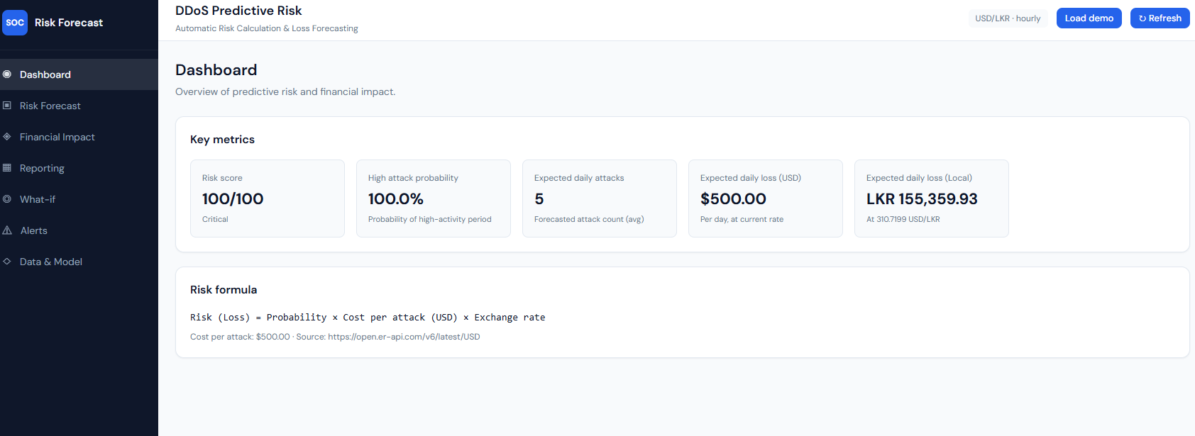
Dashboard: key metrics and risk formula.
What it shows: The main dashboard with “DDoS Predictive Risk” and “Automatic Risk Calculation & Loss Forecasting.” The Key metrics block shows: Risk score (e.g. 100/100, Critical), High attack probability (e.g. 100.0% – probability of a high-activity period), Expected daily attacks (forecasted attack count average), Expected daily loss (USD) and Expected daily loss (Local) (e.g. LKR at the current USD/LKR rate). The Risk formula is stated as: Risk (Loss) = Probability × Cost per attack (USD) × Exchange rate, with cost per attack (e.g. $500) and the exchange-rate source (e.g. open.er-api.com). Header controls include currency/granularity badge, “Load demo,” and “Refresh.”
Explanation: This is the overview of predictive risk and financial impact. All numbers come from GET /api/risk/overview. The risk score and high attack probability are computed from the ARIMA forecast and history; expected daily attacks and losses use the same forecast and the risk formula with the live exchange rate. "Load demo" toggles demo data; "Refresh" refetches from the API.
Figure 6: Risk Forecast – Screenshot 2026-03-08 045218.png
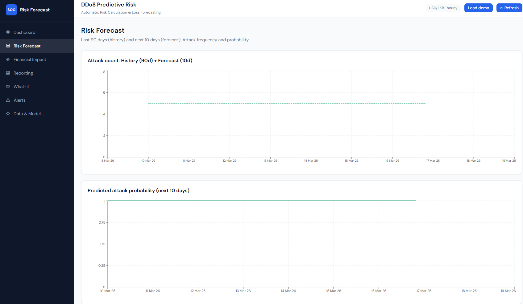
Risk Forecast: history (90d) + forecast (10d), attack count and probability.
What it shows: The “Risk Forecast” page with subtitle “Last 90 days (history) and next 10 days (forecast). Attack frequency and probability.” Chart 1 – “Attack count: History (90d) + Forecast (10d)”: a line chart with time on the x-axis (e.g. 9 Mar 26–19 Mar 26). One line is history (actual attack counts over the last 90 days); a second, dashed line is the forecast (next 10 days). With demo or sparse data the forecast can be a flat line (e.g. constant 5 attacks/day). Chart 2 – “Predicted attack probability (next 10 days)”: a line over the same 10-day window showing daily attack probability (0–1). Often high and flat (e.g. ~0.9) when the forecast is constant.
How it connects: Data is from overview.history and overview.forecast. History is backend-aggregated daily (or hourly→daily) counts; forecast is ARIMA (or median baseline when <30 points). Probability is derived from predicted_attacks and the 95th-percentile baseline.
Figure 7: Financial Impact – Screenshot 2026-03-08 045224.png
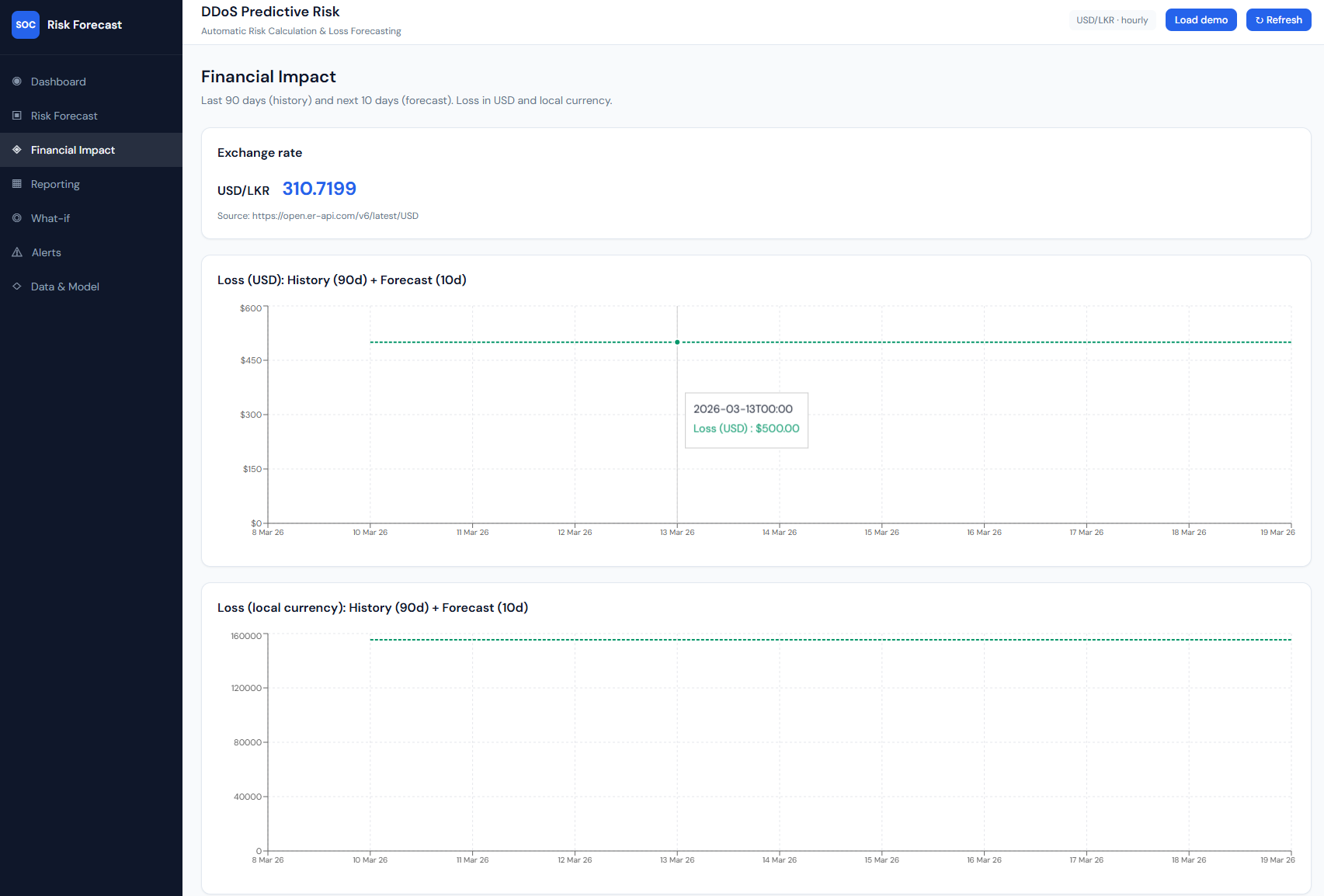
Financial Impact: exchange rate and loss in USD and LKR.
What it shows: The “Financial Impact” page: “Last 90 days (history) and next 10 days (forecast). Loss in USD and local currency.” An Exchange rate card shows the currency pair (e.g. USD/LKR), rate (e.g. 310.7199), and source URL. Two line charts: Loss (USD): History (90d) + Forecast (10d) – daily loss in dollars (y-axis), time on x-axis; and Loss (local currency): History (90d) + Forecast (10d) – same structure in LKR (or configured target). Tooltips on the lines show date and loss value (e.g. $500.00 or LKR 155,359.93).
How it connects: History and forecast loss come from the same overview: each day’s loss = attack_probability × cost_per_attack × exchange_rate. The backend uses fetch_exchange_rate() for live conversion; the frontend uses overview.history and overview.forecast for both charts.
Figure 8: Reporting – Screenshot 2026-03-08 045228.png
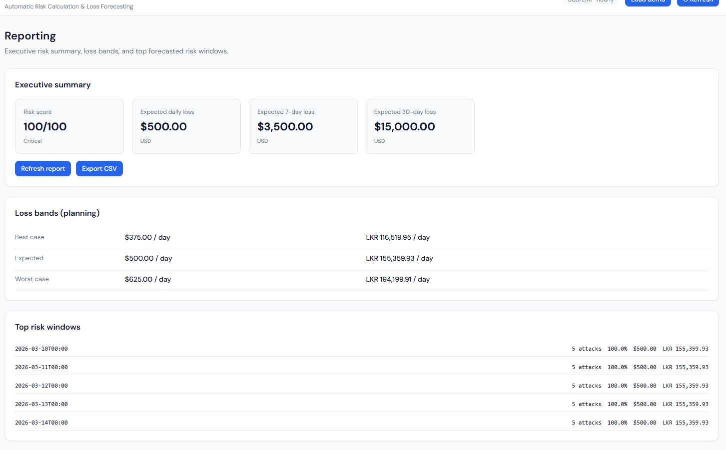
Reporting: executive summary, loss bands, top risk windows.
What it shows: The “Reporting” page with three blocks. Executive summary: Risk score (e.g. 100/100, Critical), Expected daily loss ($500.00 USD), Expected 7-day loss ($3,500), Expected 30-day loss ($15,000), plus “Refresh report” and “Export CSV” buttons. Loss bands (planning): A table with Best case (e.g. $375/day, LKR 116,519.95), Expected ($500/day, LKR 155,359.93), Worst case (e.g. $625/day, LKR 194,199.91). Top risk windows: A list of future dates (e.g. 10 Mar 26–14 Mar 26, 00:00) with for each: predicted attacks (e.g. 5), probability (e.g. 100.0%), loss in USD and LKR. A “Reporting notes” section explains how risk and loss are computed.
How it connects: All from GET /api/risk/report. Loss bands are 0.75×, 1.0×, 1.25× of expected daily loss. Top risk windows are the forecast points sorted by loss (highest first), limited to five. Export CSV uses GET /api/risk/export.csv.
Figure 9: What-if Simulator – Screenshot 2026-03-08 045238.png
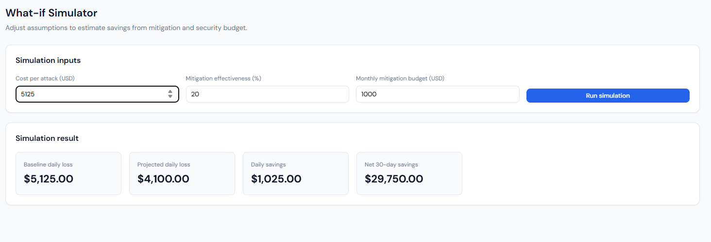
What-if Simulator: inputs and simulation result.
What it shows: The “What-if Simulator” page: “Adjust assumptions to estimate savings from mitigation and security budget.” Simulation inputs: Cost per attack (USD), Mitigation effectiveness (%), Monthly mitigation budget (USD), and a “Run simulation” button. Simulation result: After running, four cards show Baseline daily loss (e.g. $5,125), Projected daily loss (e.g. $4,100 after mitigation), Daily savings (e.g. $1,025), and Net 30-day savings (e.g. $29,750 – savings over 30 days minus the monthly budget).
How it connects: Frontend sends the three inputs to POST /api/risk/what-if (with optional ?demo=1). Backend uses the current overview’s expected daily loss to get a baseline probability, then applies the user’s cost per attack and mitigation % to compute projected loss and savings; net 30-day savings = (daily savings × 30) − budget.
Figure 10: Active Alerts – Screenshot 2026-03-08 045242.png
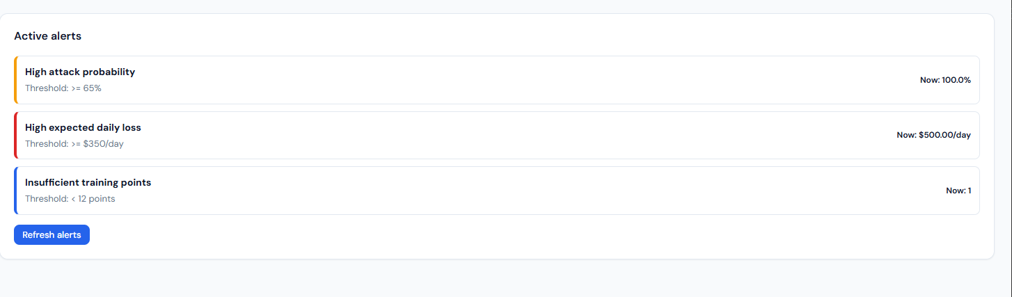
Active alerts: threshold-based alerts and current values.
What it shows: The “Alerts” page: “Threshold-based alerts for proactive risk monitoring.” An “Active alerts” card lists only the rules that are currently triggered. Each row has a severity bar (e.g. yellow=high, red=critical, blue=medium), the rule name (e.g. “High attack probability,” “High expected daily loss,” “Insufficient training points”), the threshold (e.g. ≥65%, ≥$350/day, <12 points), and the current value (e.g. 100.0%, $500.00/day, 1). A “Refresh alerts” button re-fetches from the API.
How it connects: Data from GET /api/risk/alerts. The backend builds alerts from the risk overview: high attack probability (probability_of_high_attack ≥ 0.65), high daily loss (expected_daily_loss_usd ≥ 350), insufficient training points (training_points < 12). Only triggered rules are returned, so the list is empty when no thresholds are exceeded.
11. Special code snippets
Risk formula and forecast (backend)
backend/app/main.py – building forecast points and loss:
probability_baseline = max(1.0, float(series["attack_count"].quantile(0.95)))
for ts, predicted_attacks in zip(forecast_timestamps, forecast_values):
    attack_probability = min(1.0, predicted_attacks / probability_baseline)
    loss_usd = attack_probability * settings.avg_cost_per_attack_usd
    loss_local = loss_usd * exchange.rate
    points.append(ForecastPoint(timestamp=..., predicted_attacks=..., attack_probability=..., loss_usd=..., loss_local=...))
ARIMA forecast and short-series fallback
backend/app/forecast.py – training and forecasting:
def train_arima_and_forecast(daily_counts: pd.DataFrame, forecast_days: int) -> list[float]:
    series = daily_counts["attack_count"].astype(float)
    if len(series) < 30:
        fallback = float(series.tail(min(8, len(series))).median()) if len(series) > 0 else 0.0
        return [max(0.0, fallback) for _ in range(forecast_days)]
    model = ARIMA(series, order=(1, 1, 1))
    fitted = model.fit()
    forecast = fitted.forecast(steps=forecast_days)
    return [max(0.0, float(v)) for v in forecast.tolist()]
Risk score and level
backend/app/main.py – score and level from probabilities:
def _compute_risk_score(probability_of_high_attack: float, expected_probability: float) -> int:
    score = (probability_of_high_attack * 0.55) + (expected_probability * 0.45)
    return int(round(max(0.0, min(1.0, score)) * 100))

def _risk_level(score: int) -> str:
    if score >= 75: return "Critical"
    if score >= 55: return "High"
    if score >= 35: return "Medium"
    return "Low"
Manual attack recording (API)
backend/app/main.py – in-memory manual attacks merged into series:
@app.post("/api/risk/attack", response_model=ManualAttackResponse)
def record_manual_attack(request: ManualAttackRequest) -> ManualAttackResponse:
    date_str = request.date or date.today().isoformat()
    _manual_attacks[date_str] = _manual_attacks.get(date_str, 0) + request.count
    return ManualAttackResponse(ok=True, date=date_str, count=request.count, message=...)
_merge_manual_attacks(series, granularity) adds these counts to the loaded series so overview/report reflect them.
Classification training (script)
scripts/run_train_and_evaluate.py – classifiers and metrics:
rf = RandomForestClassifier(n_estimators=100, max_depth=15, random_state=RANDOM_STATE, n_jobs=-1)
xgb_model = xgb.XGBClassifier(n_estimators=100, max_depth=8, random_state=RANDOM_STATE, n_jobs=-1, eval_metric="mlogloss")
# ...
m_rf = metrics(y_test, y_pred_rf)   # Accuracy, Precision, Recall, F1
m_xgb = metrics(y_test, y_pred_xgb)
# Confusion matrix: confusion_matrix(y_test, y_pred_xgb)
Config (env-driven)
backend/app/config.py – main settings:
dataset_dir, base_currency, target_currency, avg_cost_per_attack_usd,
history_days=90, forecast_days=10, min_training_points=5